


Freekit Design System
Components

Sidebar

Dropdown

Search Dropdown

More Components Soon
Styles

Color System

Typography

Back

Side Navigation
Side navigation lets users navigate the entire content of a product or a section. These can be used for a single level or a multi-level navigation. The side navigation helps people move around within a subsection of a product. For example, navigating through the topics in a Confluence space, or to specific tasks within their Figmakit.
The side navigation helps people move around within a subsection of a product. For example, navigating through the topics in a Confluence space, or to specific tasks within their Figmakit.


Live Demo

Siren.uix

Discover Templates

My Latest Post
03
Work Sections
Follow Me


12

A Join India’s largest WhatsApp community for designers.

Join Now

Desktop - 260px
Siren.uix
Work Sections

Tablet - 225px
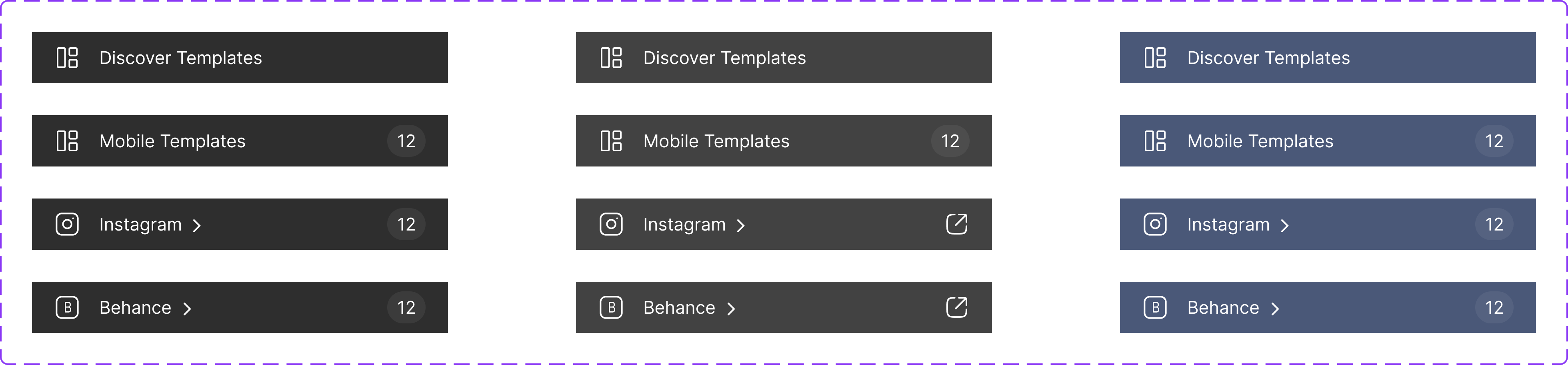
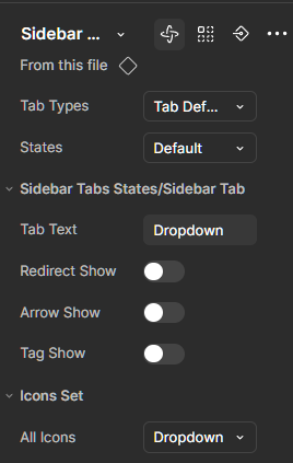
Side Navigation Tab States
In Figmakit, I crafted an interactive side navigation using Figma's component properties — no code needed! Just three smartly designed states brought it all to life.
- Default
- Hover
- Active
1

2
3
Spacing (4px Grid System)
An accordion groups sections of related content that can be opened and closed. Accordions decrease cognitive load by letting people choose which sections of content they see, like questions in an FAQ.
Never put information that's required for the current task inside an accordion.
Siren.uix
Discover Templates
My Latest Post
Work Sections

Mobile Templates
32

Website Templates
08
A Join India’s largest WhatsApp community for designers.
Join Now
Siren.uix
Discover Templates
My Latest Post
Work Sections
Mobile Templates
32
Website Templates
08
A Join India’s largest WhatsApp community for designers.
Join Now
6px
6px
6px
6px
16px
16px
16px
16px
16px
16px
14px
14px
14px
14px

Desktop - 260px

Tablet - 225px
Freekit Design System
Components
Sidebar
Dropdown
Search Dropdown
More Components Soon
Styles
Color System
Typography
Back
Side Navigation
Side navigation lets users navigate the entire content of a product or a section. These can be used for a single level or a multi-level navigation. The side navigation helps people move around within a subsection of a product. For example, navigating through the topics in a Confluence space, or to specific tasks within their Figmakit.
The side navigation helps people move around within a subsection of a product. For example, navigating through the topics in a Confluence space, or to specific tasks within their Figmakit.
Live Demo
Siren.uix
Discover Templates
My Latest Post
03
Work Sections
Follow Me
12
A Join India’s largest WhatsApp community for designers.
Join Now

Desktop - 260px
Siren.uix
Work Sections

Tablet - 225px
Side Navigation Tab States
In Figmakit, I crafted an interactive side navigation using Figma's component properties — no code needed! Just three smartly designed states brought it all to life.
- Default
- Hover
- Active
1
2
3
Spacing (4px Grid System)
An accordion groups sections of related content that can be opened and closed. Accordions decrease cognitive load by letting people choose which sections of content they see, like questions in an FAQ. Never put information that's required for the current task inside an accordion.
Siren.uix
Discover Templates
My Latest Post
Work Sections
Mobile Templates
32
Website Templates
08
A Join India’s largest WhatsApp community for designers.
Join Now
Siren.uix
Discover Templates
My Latest Post
Work Sections
Mobile Templates
32
Website Templates
08
A Join India’s largest WhatsApp community for designers.
Join Now
6px
6px
6px
6px
16px
16px
16px
16px
16px
16px
14px
14px
14px
14px

Desktop - 260px

Tablet - 225px